Capital One

Identity System
About One Brand
One Brand was Capital One's strategic pivot to unify its fragmented enterprise assets into one cohesive, digital-first design system, standardizing UI components, typography, imagery, and color across every customer-facing touchpoint the company owned.

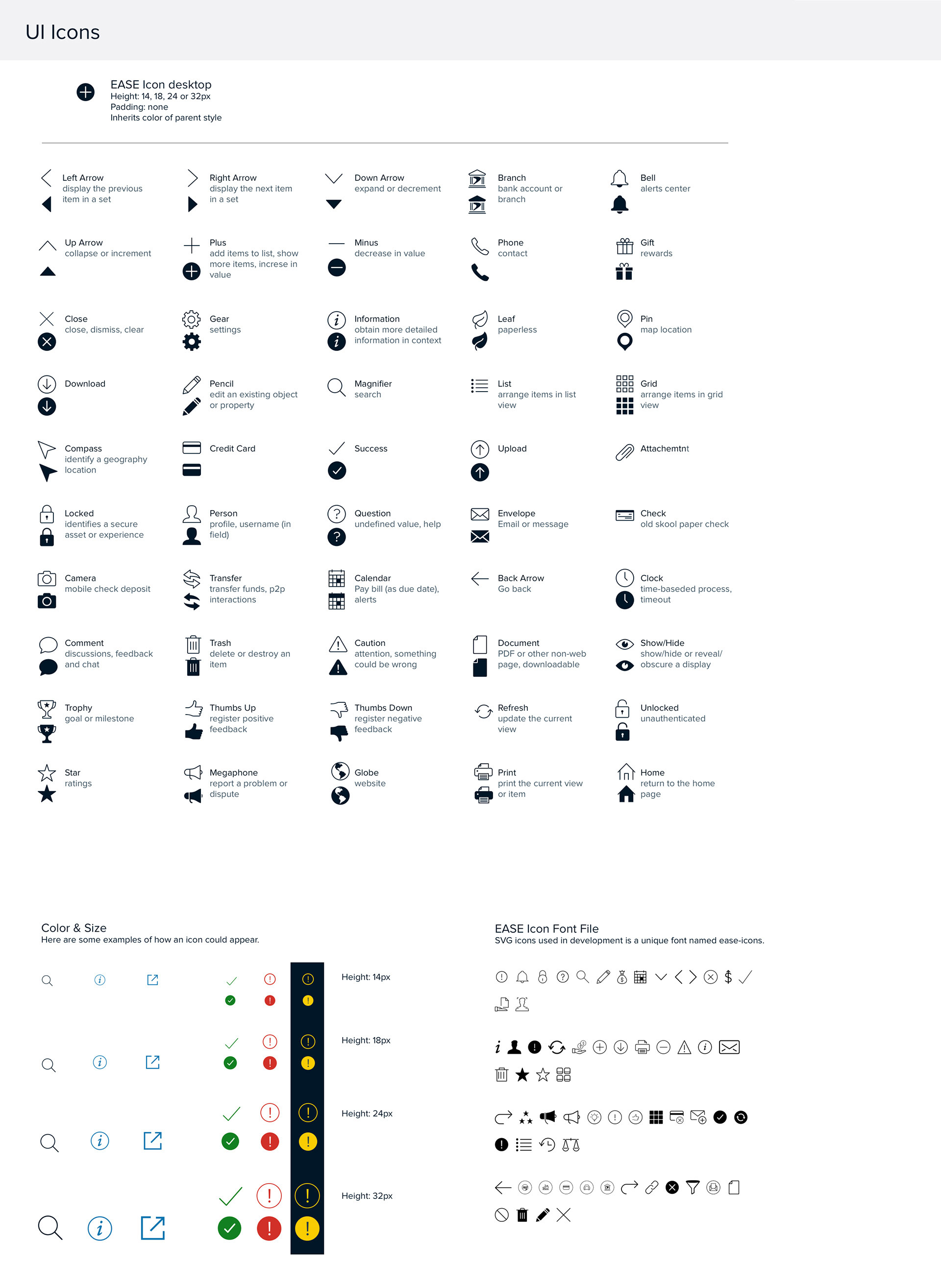
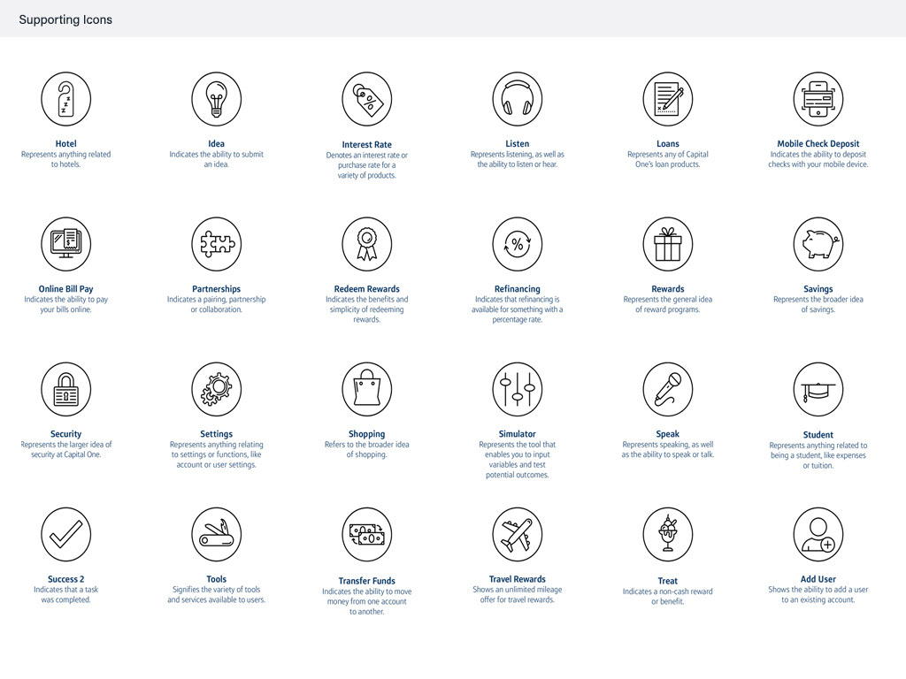
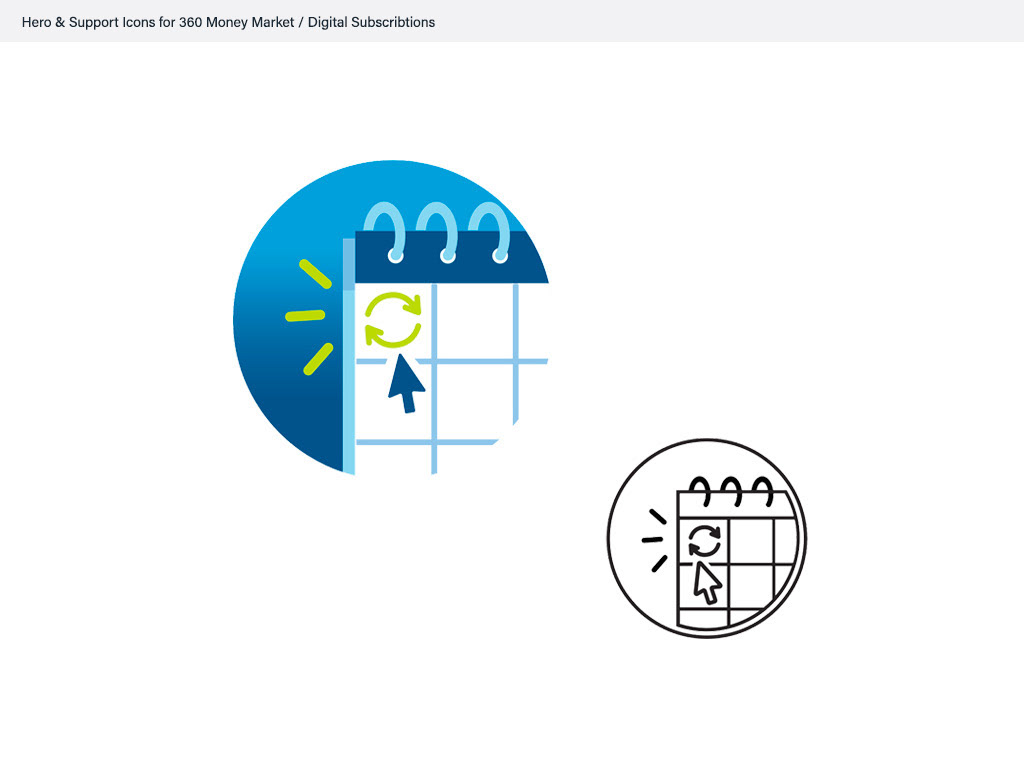
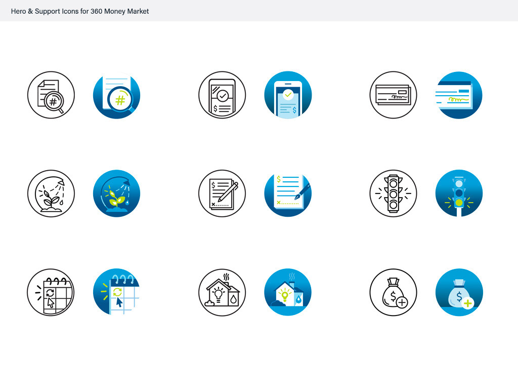
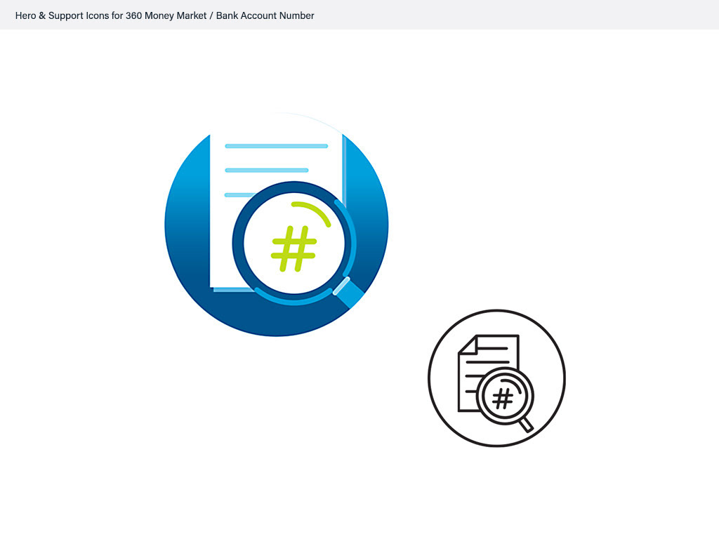
Iconography
The system prioritized flexible, modular UI components built for both mobile and web — banking, credit management, and rewards all drawing from the same underlying library instead of being rebuilt separately for each product. I owned the style guides and documentation defining how design work got made across Capital One — iconography, design tokens for color, typography, spacing, and motion — so any designer on any team could produce work that matched the system, not just referenced it.

Interaction Patterns & User Experience
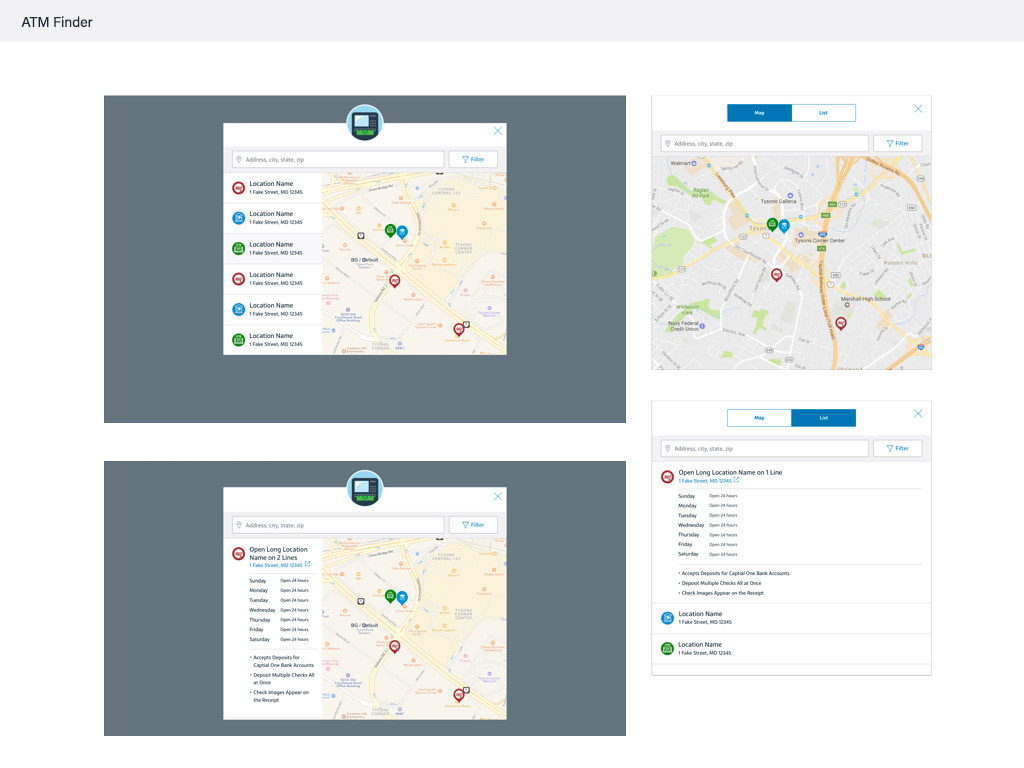
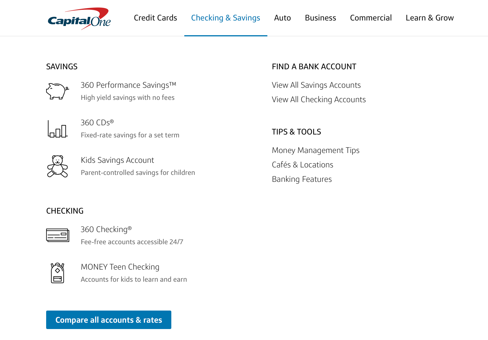
Consistency wasn't only visual — it had to hold up in how a customer actually moved through the product. From user journeys to wireframes to interactive prototypes, I led the redesign of navigation and simplified layouts, building the visual libraries that carried through into digital products. The result: a customer checking a balance or applying for a card moved through the experience without friction, at any step.