Capital One

One Brand
Visual Identity
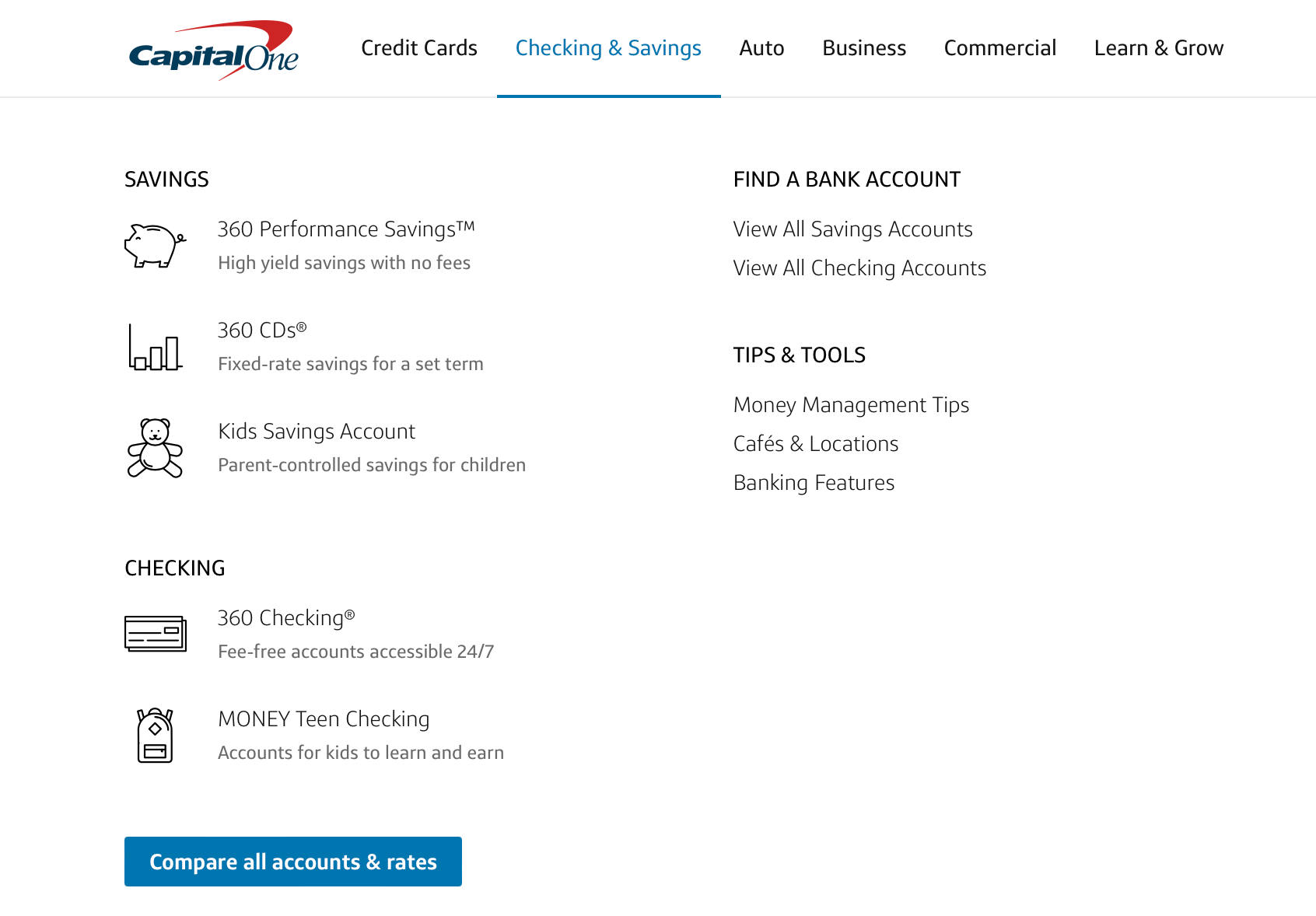
Capital One’s design evolution began with a comprehensive audit of its existing UI/UX landscape. This work established a renewed visual identity that connects with a broad and diverse user base while clearly reflecting the brand’s core values of innovation, trust, and accessibility.
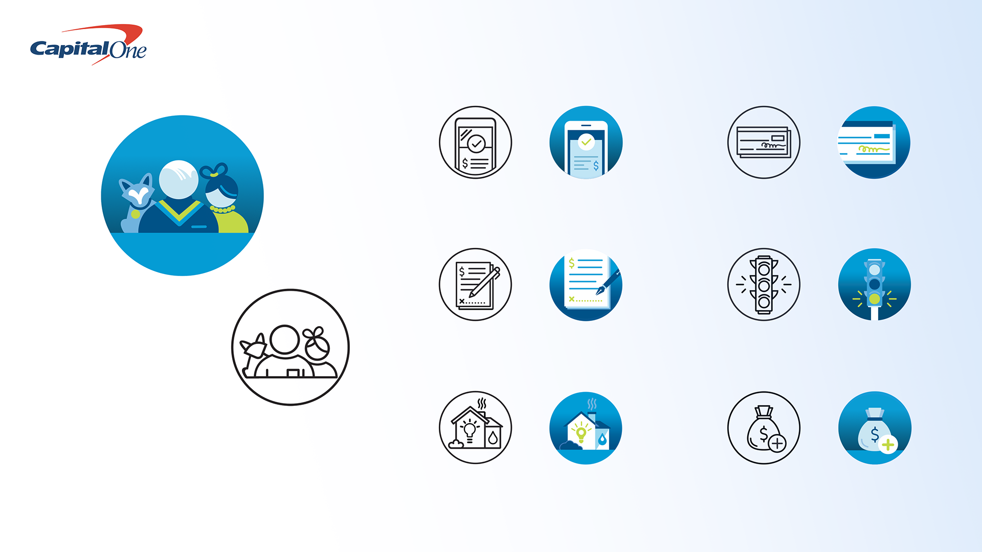
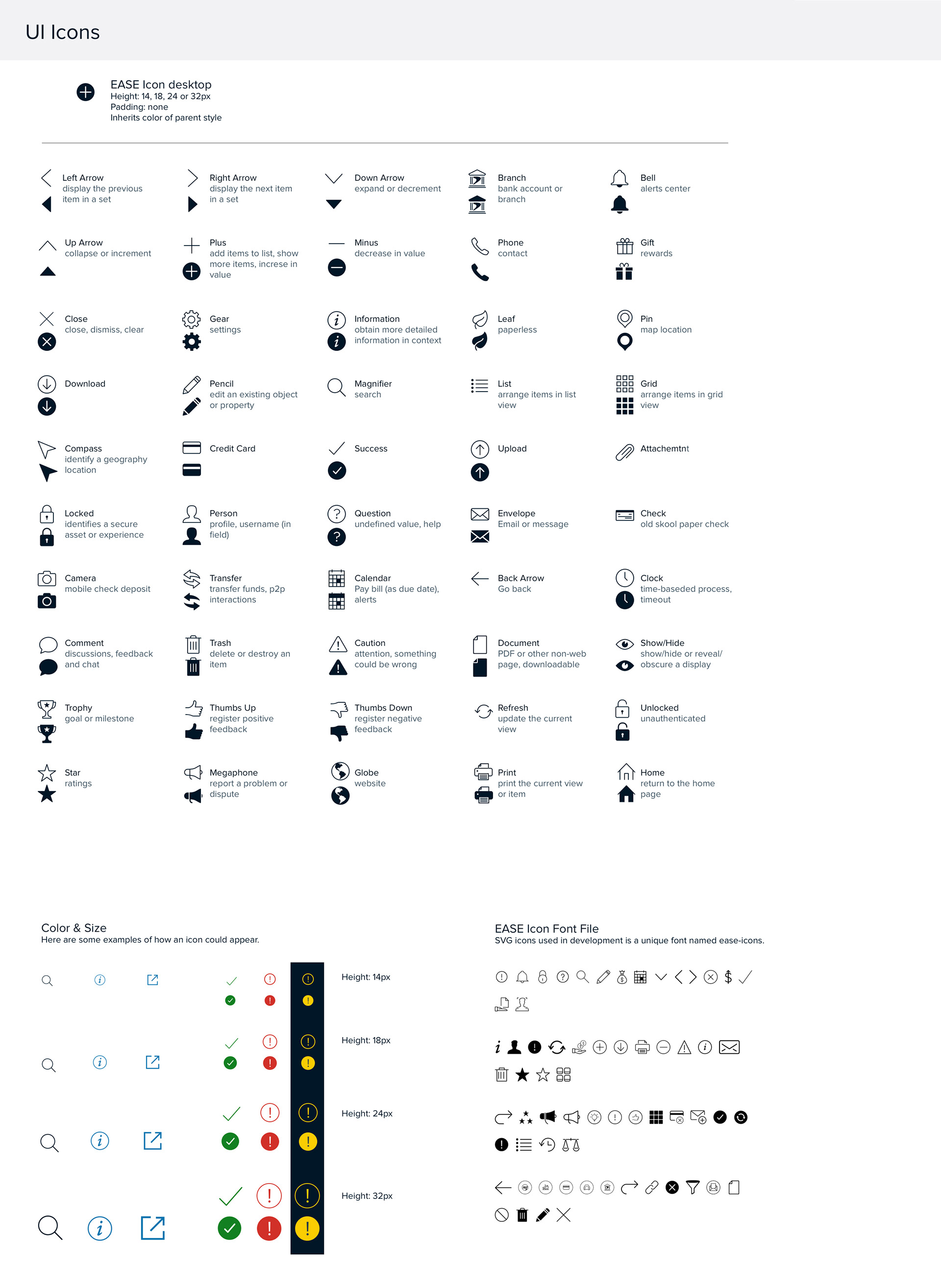
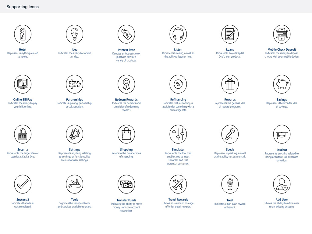
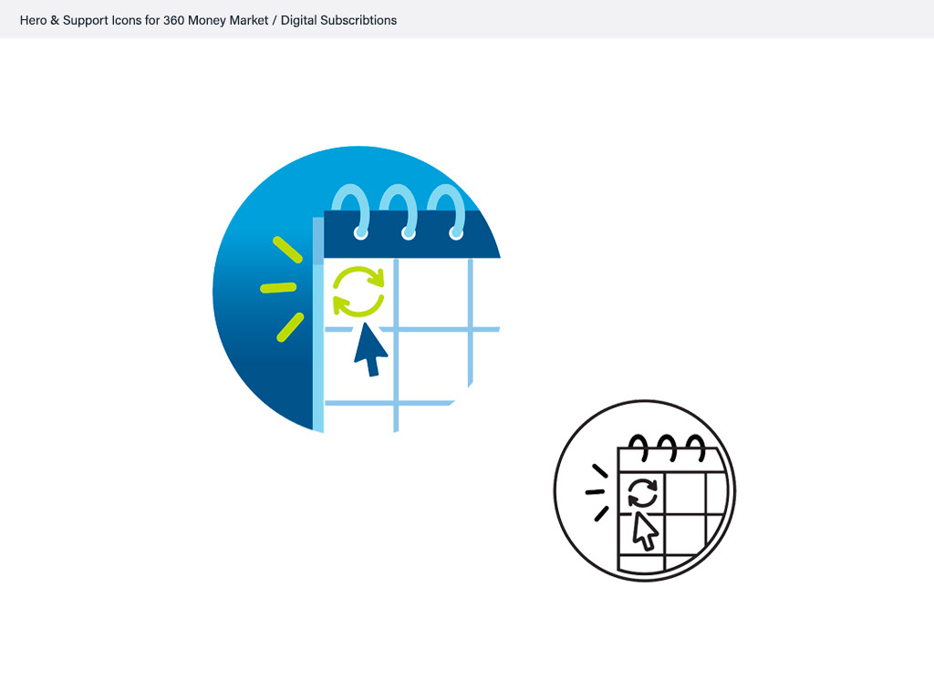
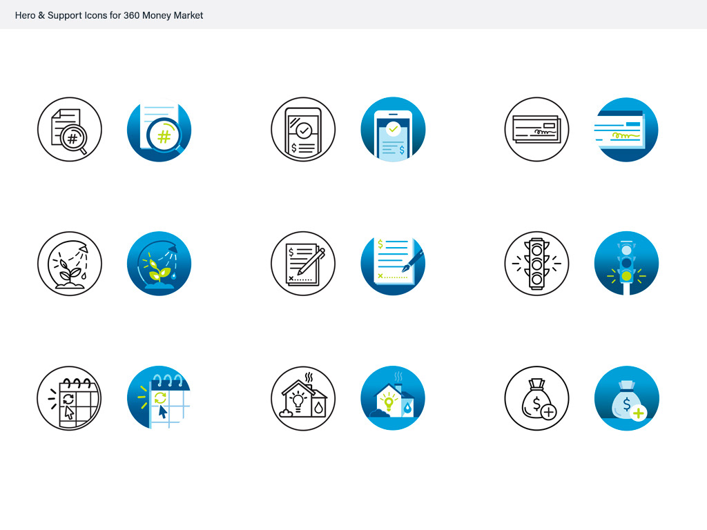
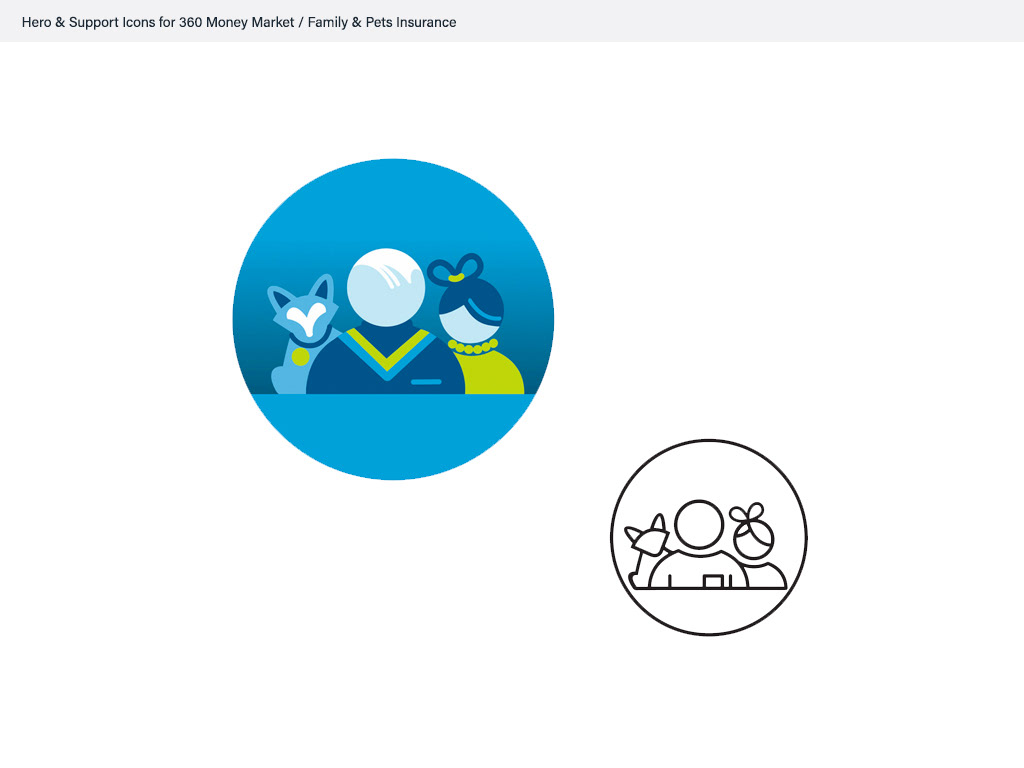
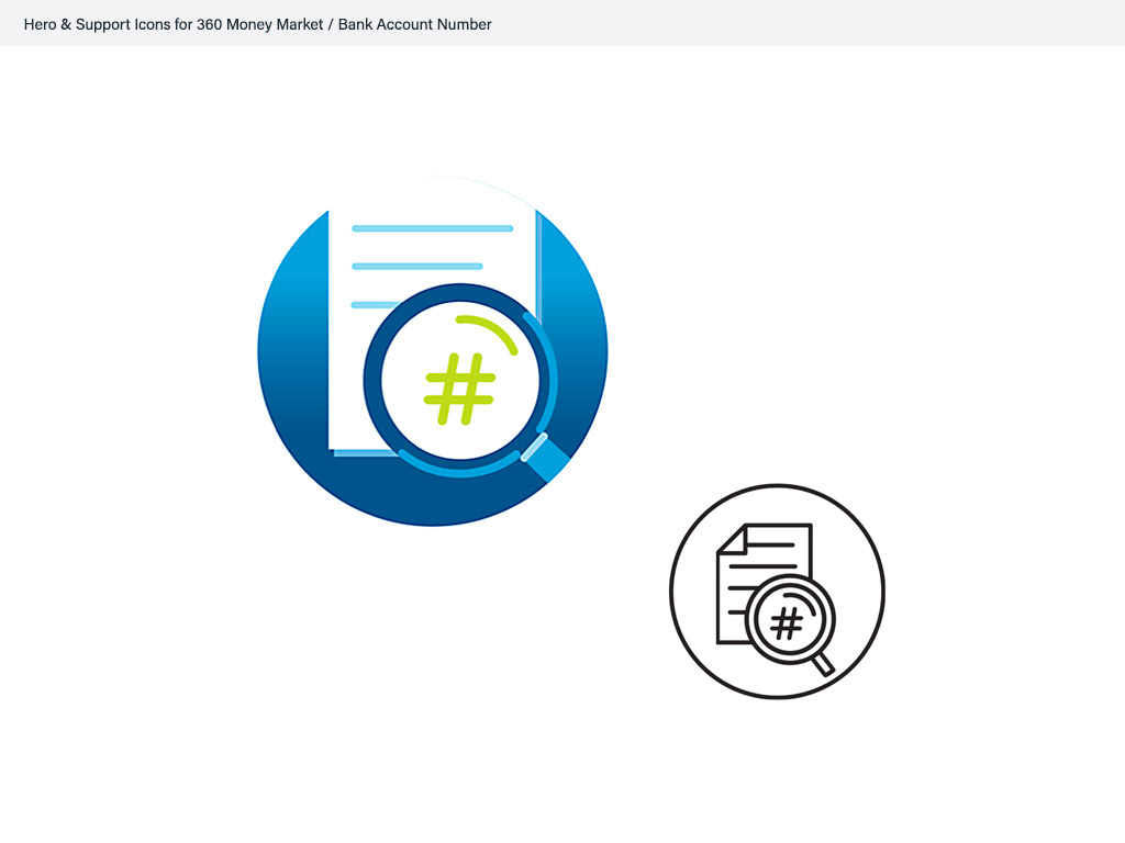
Iconography
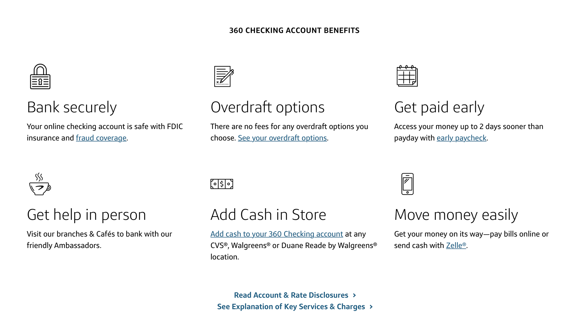
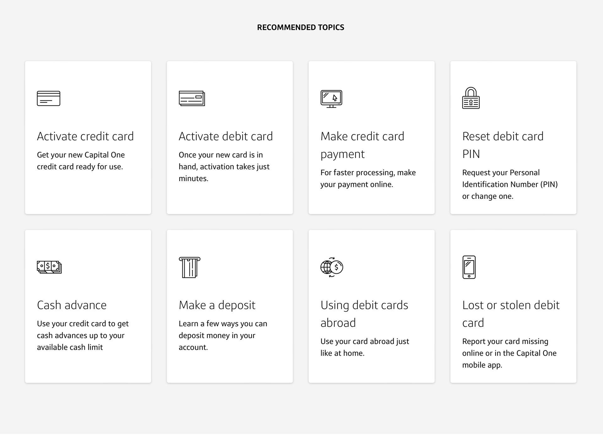
At the heart of this transformation was the creation of a flexible visual system, developed to scale across teams and platforms. I contributed to the design of modular UI components, an extended iconography set, and a refined collection of design tokens—covering color, typography, spacing, and motion principles. Together, these elements provided a foundation for consistent design application, improved accessibility, and a recognizable brand experience across digital products.
Interaction Patterns & User Experience
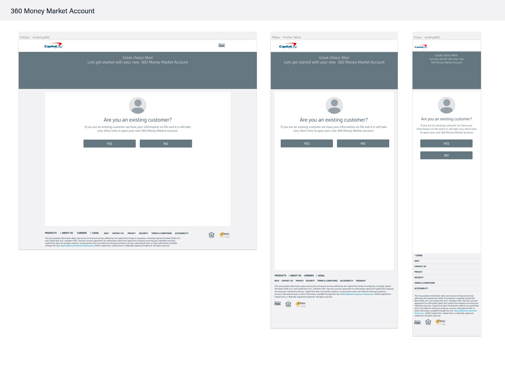
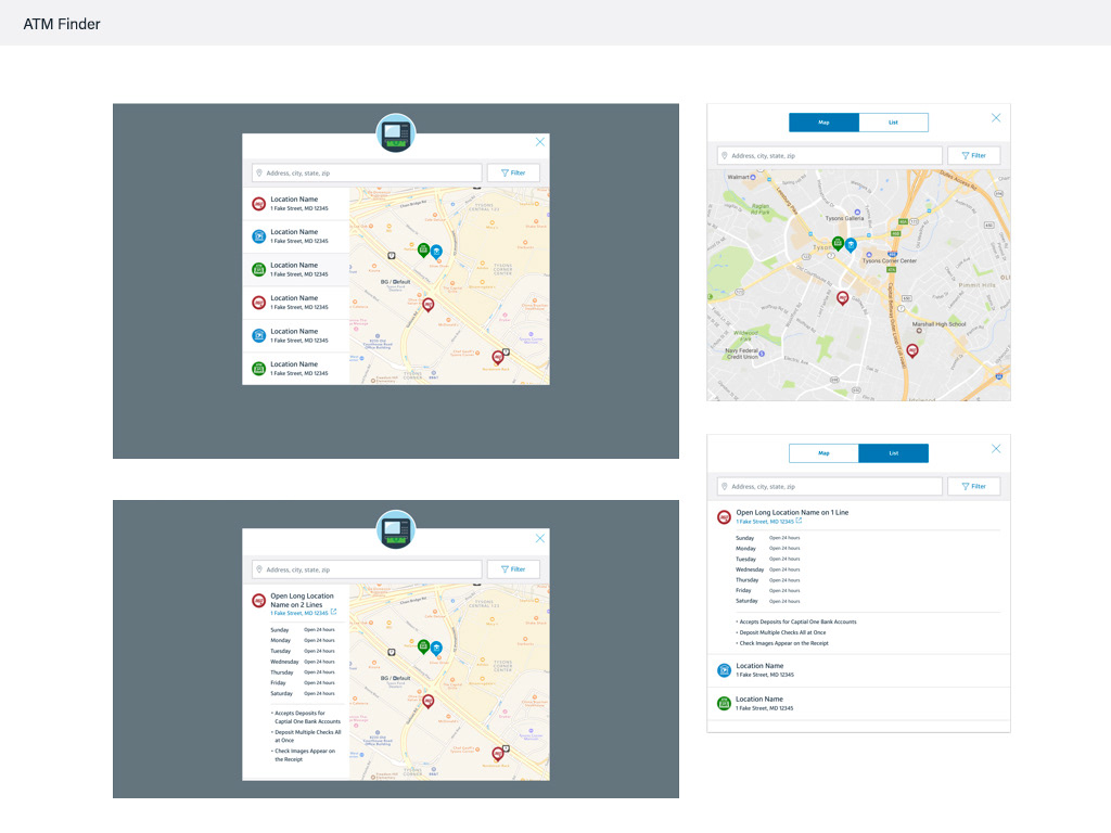
To address gaps in usability, I worked on redesigning key interaction patterns and simplifying areas of friction within the interface. This included clarifying navigation paths, reducing redundant flows, and adjusting complex layouts that previously hindered comprehension or accessibility.
By simplifying task flows and refining component behavior, we reduced visual noise and cognitive load, making interactions more intuitive. Every improvement was guided by user feedback and data-driven insight, ensuring the interface functioned effectively—not just visually, but in real use. The result was a more accessible and reliable experience that supported Capital One’s goals of long-term customer trust and scalable usability.